In the first chapter dedicated to writing scripts and calligraphy, we left off with a mention of the Insular and the Beneventan scripts. Both have a strong connection to their place of origin and to both ancient and Christian traditions.
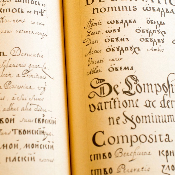
The Insular script was developed in Ireland and Great Britain between the 8th and 10th centuries AD. It used soft harmonious shapes and included both lower and upper case letters. It quickly spread to the European continent with the migration of Irish monks to French and German monasteries. Beneventana, on the other hand, circulated in central-southern Italy between the 8th and 13th centuries. Among its various forms, the most widely used were the Montecassino script, recognisable by its broken lines, and the Bari one, which was decidedly rounder.
From the language of the Empire to the Gothic ones
It is Christmas Eve in the year 800. Charlemagne is crowned emperor of the Holy Roman Empire. A promoter of literacy, the former Lombard king fought for a single, centralising script that would go beyond local particularisms. His ambitious project, the Littera Antiqua, was inspired by Roman scripts and found its most important production centre in the Monastery of St Martin of Tours.
For the next step in the evolution of writing scripts, we remain in France, where, between the 11th and 12th centuries, the Littera Moderna (as opposed to Littera Antiqua Carolina) came to light. This rather rigid, vertical and compact script was composed of straight and angular strokes, with a repetitive rhythm. Though this script was certainly elegant, it wasn’t very legible. But that small detail didn’t stop it from becoming popular throughout Europe under the new name Gothic, (in other words, Barbarian) chosen by the Italian Renaissance literati.
The Gothic script spread like wildfire: by the 13th century it was already known throughout Europe. Its popularity can be explained by two factors. On one hand, it was caused by the social changes of the time that took the exclusivity of book production away from monasteries and abbeys and on the other, by the emergence of universities. In such a context, a simple and fast writing system that was suitable for the reproduction of identical looking copies was needed.
The elementary shape composed mostly of vertical strokes and with a reduced horizontal and vertical footprint due to its very narrow line spacing made the Gothic script ideal to save space while copying. During that time, a variety of different Gothic scripts flourished. The first type of ‘barbarian’ script is the German Textura (the one used in the first Gutenberg Bible). In Italy, the first form of Gothic is called Rotunda, because of its sinuous lines.
The humanists’ new type of classical script
Evolution in the field of writing has always been unstoppable. So much so that, from the 15th century, even the Gothic scripts came to an end. Used for all kinds of texts because of their ease of use, these scripts were nevertheless never accepted by the literary elite. Sick of having to read ancient classics in ‘barbaric’ characters, the humanists with Petrarch as the spearhead, wanted to replace them with a script that could recall Latin shapes.
The Humanists began a careful comparative analysis of the various types of scripts at their disposal, trying to bring back to life the original ‘classic’ version. Rummaging through libraries and archives, they found themselves leafing through old pages written in the Carolina script, which they came to regard as the true classical Roman script. Using it as their foundation, they codified a new style.
At the dawn of the 15th century, this new yet ancient script was modified by Poggio Bracciolini and Niccolò Niccoli, who decided to rename it Antiqua Umanistica. This clear, thin and orderly script is not the only one to take a foothold in those years. Alongside the Antiqua Umanistica, a cursive script inspired by the style of merchants and notaries, the Italica or Cancelleresca, also made its appearance. As clear as the language of the previously mentioned scholars, the latter was nevertheless more elegant and compact. This script which started off as purely functional, soon became in all respects a calligraphic style.