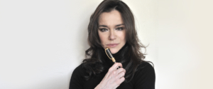
Marta Sansoni, the designer of Cage collection
Visconti is pleased to present another limited edition designer pen. Marta Sansoni, an architect and interior designer of international calibre, already known for her long collaboration with Alessi and member of the former Italian Design Council, brings us Visconti’s latest limited edition original design.
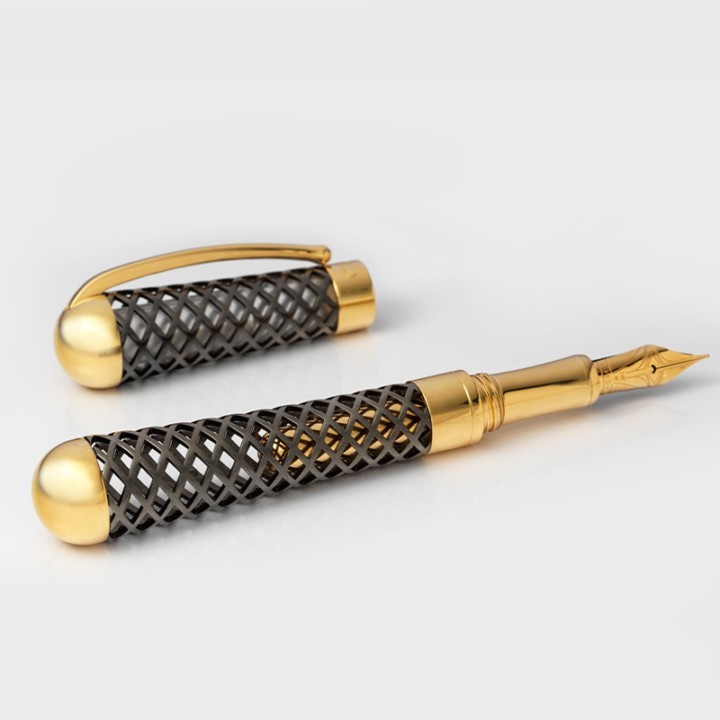
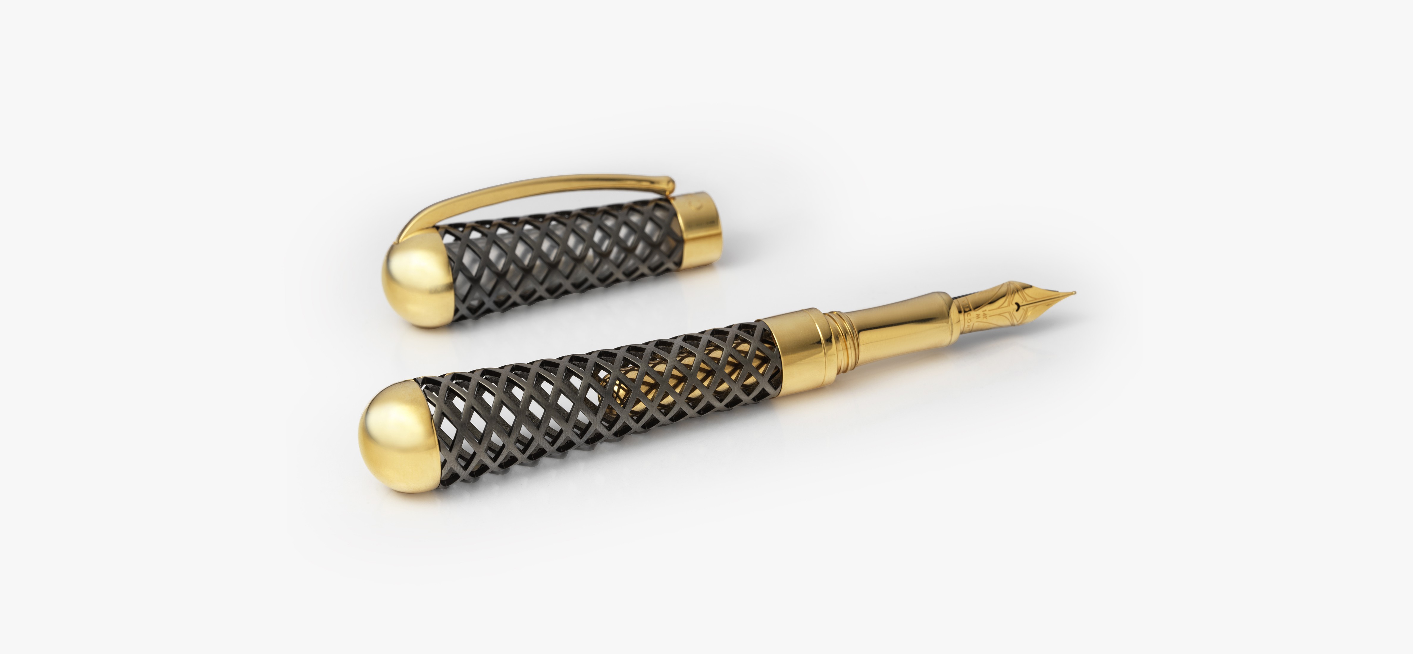
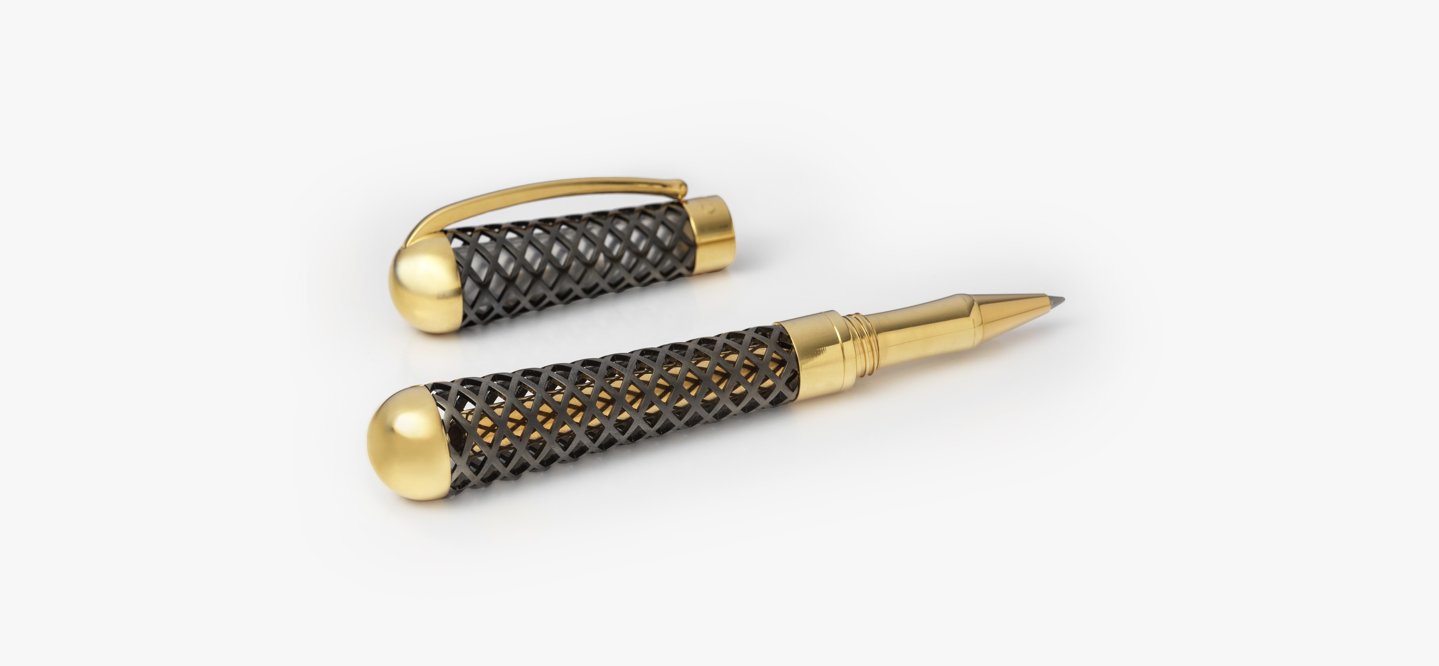
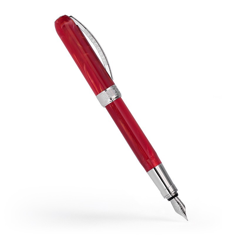
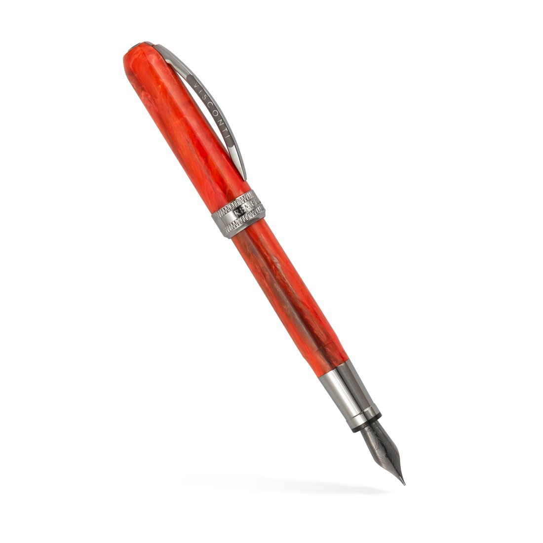
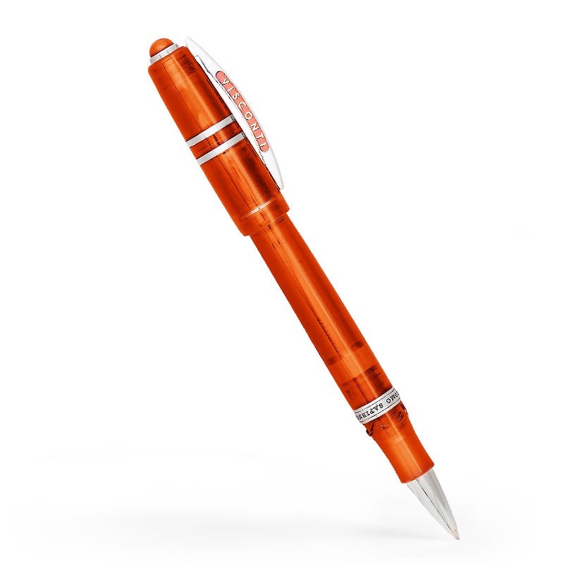
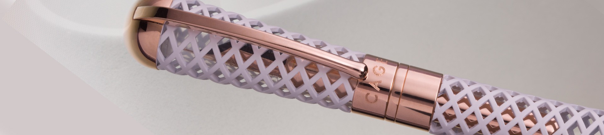
Elegant and full of meaning, Cage is characterised by a refined grid structure that draws the eye in towards tantalising glimpses of gold. Cage’s textured body gives the person who grips it a sense of strength combined to a pleasant tactile sensation. The collection, available in two variants, Matt White and Black Diamond and both fountain pen and rollerball versions, carries an important message.
Marta Sansoni herself reveals the inspiration behind the pen. In this interview, she talks about her creative vision, her references and the process that led her to design this writing instrument.
How did the collaboration with Visconti come about?
The company wanted me to design a feminine pen, a pen that would tone down the classic concept of the writing instrument. The aim was to offer a pen designed entirely by a woman.
Today, even though we have the same professions as men, gender equality is an issue that must not be overlooked. I, for example, use the pen mainly for drawing; I have a rather analogue approach to my work. For my architectural and design sketches, I prefer to use fountain pens or rollerballs.
What is behind the design of the Cage?
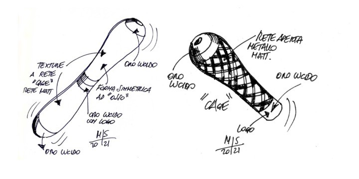
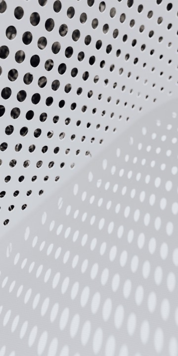
Cage has an innovative shape that is very different from other Visconti models. I tried to give it roundness and softness to evoke the feminine personality and silhouette. The name of the pen finds its concrete expression in the grid. The perforated pattern in brass requires a virtuosity that has always fascinated me. My first example of openwork was for the Cactus basket I designed for Alessi in 2002 and which I later applied to the YouSpoon spoon, designed for the same Italian brand.
I love experimenting with openwork not only in design, but also in architecture. I like to connect spaces through elements that filter light, such as grilles and glass. I always choose textures and materials that partially screen the space: the void plays a functional role in my designs. The grid is a form of protection, a barrier that makes us perceive three-dimensionality more. It also gives a very special sensation to the touch.
Can you tell us something about the choice of materials?
The first prototype was made in plastic and had an anthropomorphised shape. It was quite a playful pen, perhaps more in line with my previous work. But this project required a different approach. That’s why, for the subsequent prototypes, I revised the entire design. To do this, I started with the choice of metal for the grid. I needed a durable material that would emphasise the weight and value of the writing instrument. Personally, I enjoy drawing much more with heavier pens, which give a certain solidity.
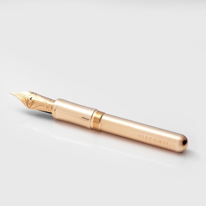
The Cage pen comes in two versions. The anthracite version recalls the colour and materiality of slate, of lava stone. The shiny gold part is designed to bring a contrasting luminosity to the pen. The chalk white version, on the other hand, is embellished with metal parts plated in rose gold.
Did you get technical support from the company for the actual production of the pen?
Visconti’s expert craftsmen use very unique and meticulous techniques; they are real jewellery techniques. Cage is a pen that is perfect in every detail, designed just like a real jewel. The craftsmen made all the versions of my project: they fully understood my creative vision and impeccably translated my design sketches into their physical representation. I was very impressed by Visconti’s high level of workmanship.
Though Visconti's history is recent, it has numerous collections. Which is your favourite pen?
I think my favourite collection is the Homo Sapiens Lava. I especially like the Lava Dark Age for its minimal lines and pleasant feel. My personal style is a bit distant from Visconti’s more visually stunning pens. I identify better to the models with a more minimal design.
During your career you have worked with big international names: who are your inspirational figures in the world of architecture and design?
In my formative years, my points of reference were Remo Buti, Ettore Sottsass and Alessandro Mendini. I would say that I drew more from the Milanese school of thought than from the Florentine one. I grew up surrounded by pop inspirations, ironic design and playful references.
I also like the essentiality of John Pawson and Claudio Silvestrin. I can’t be as minimalist in my designs as them, but when I am working, I like to keep their succinct aesthetic in mind. I think my style is constantly evolving. My profession is a continuous learning experience and a long maturing process. I would love to be able to redo my projects once they have been turned in, to tackle them with a greater sense of awareness.
You told us about the importance of irony in your creative approach: is it difficult to translate it into architecture and design projects?
It was Remo Buti’s school that taught me to take inspiration from pop culture. Stefano Giovannoni and Guido Venturini also come from the same architectural movement: I remember with pleasure their irreverent and memorable outdoor Rabbit Chair. I have a slightly softer approach, I am ironic, but in a more subtle way. The Pinolio oil cruet and the Bunny biscuit holder designed for IVV, for example, are two creations that represent the playful aspect of my style.
The Cage pen designed for Visconti, on the other hand, comes from another aesthetic language that recalls the one of jewellery. I believe that behind every design object there has to be a deep thought-process; there must always be an interesting key that gives meaning to the object itself.
Can you tell us something about your future projects?
Going back to the concept of irony in design, I am now working on Sono Tazza di Te, a cup with an anthropomorphised shape for an open-call from the DcomeDesign Association. In the future, I would also like to continue to collaborate with Visconti to create more playful objects that speak to a younger audience, like the silicone pen with a strong pop aesthetic that Gaetano Pesce designed for Visconti. These are the actors and the writing instruments that allow us to dialogue with the new generation.
Special thanks go to Marta Sansoni for her kind collaboration and availability.